
It’s been a stressful and disorienting 9 months of COVID, and a stressful week of watching the U.S. election results unfold, whether you’re American or not. Sorry, Americans, but the past 4 years have been pretty unsettling for most people in your historically allied countries. Let’s just say it hasn’t felt too friendly to anyone on the other side of the border, except maybe to Russians. Multinationalism and multinational institutions have been under threat, just when working cooperatively together is more important than ever. There is no doubt that it hasn’t just been Americans who’ve been glued to their news streams this past week. And your allies are rejoicing with those of you who are rejoicing. Welcome back, America!
So instead of sharing maps that could possibly introduce yet more stress into our lives, I thought I’d share some positive maps. Marginally uplifting maps. These maps are taken from an article entitled “Maps that show life is slowly getting better”, by Robert Muggah.
As you look at them, keep in mind what we always have to remember when looking at maps showing data averaged by country. In most of these countries there will be regions that exceed the displayed average and regions that fall short of that average value. But the fact is that in nearly every case the value has improved over time, and that is a good thing. [You can click on any map to try to see more details.]
More educated than ever.
These two maps show the mean numbers of years of schooling in each country, first in 1950 and then in 2020. As you can see, in 1950 most children outside of North America, western Europe and Australia/New Zealand had fewer than 4-6 years of schooling. This has changed dramatically in the past 70 years. Sure, there is room for further improvement, but it’s still a good-news story.

Mean years of schooling, 1950

Mean years of schooling, 2020
Huge inroads in reducing child mortality.
In early societies, it is thought that as many as 70% of children died before their 5th birthday. This has improved astronomically since the advent of vaccines, improved sanitation and access to clean water, and of course antibiotics, but the rates vary across the globe. These two maps show the improvements from 1950 to 2020.
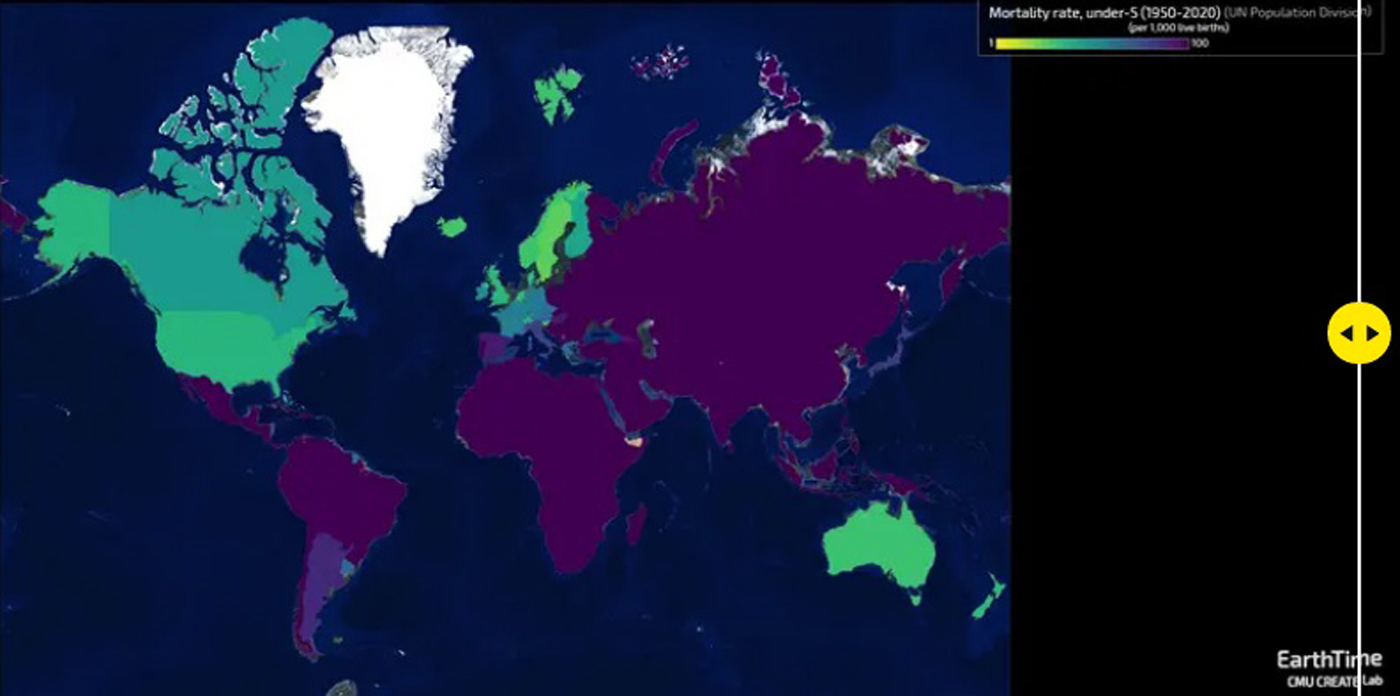
Mortality rate for children<5 per 1000 live births, 1950

Mortality rate for children<5 per 1000 live births, 2020
Life expectancy is on the rise. How high can we go?!
Life expectancy has increased dramatically in the past several decades. After all, the reason that the retirement age was established as 65 so long ago was because employers and insurance companies didn’t expect many people to live that long! These maps show the difference in life expectancy (at birth) in 1960 and then at 2020.

Life expectancy at birth, 1960

Life expectancy at birth, 2020
Bridging the digital divide.
We’re all very aware of the importance of access to reliable, high-speed Internet. That’s been important for some time now, but the pandemic has made it clear just how important it is. Suddenly – and I mean suddenly, like in a few days – everything moved from having a physical presence to being done online. Schooling, working, banking, shopping, entertainment, staying connected to friends and family – everything. Of course we hope that the pandemic will recede ASAP and we can go back to a physical presence. For most/many activities, in-person is preferable. However, I think most of us have come to accept that some things will never go back to physical presence, at least not completely. Our economies will depend on strong, ubiquitous Internet connections. And those people who don’t have reliable Internet access will be left behind.
Costa Rica had it right when they determined many years ago that Internet access was just as much a basic need as access to electricity, health, and education. It is one of their government pledges to its citizens. I think you will find that Costa Rica is a good role model in many areas of responsible governing.
These two maps show the changes in the share of the population with Internet access from 2000 to 2020.

Share of population using the Internet, 2000

Share of population using the Internet, 2020
I’m sure there are more good news stories about improvements in our world that can be described through maps. Maps of diseases that have been eradicated by vaccines and antibiotics, for example. Some of the improvements in education and life expectancy displayed in the maps above will have come about with the assistance of some of the multinational organizations that have been under threat recently, employing advances in public health.
I wonder if I can find any maps showing improvements in man’s kindness to strangers, or improvements in sharing what we have with those in need. I’ll keep looking!


Thank you for the positivity
LikeLiked by 1 person
I’ll try to find more. I think we’re going to continue to need it!
LikeLike
Thank you, thank you for sharing those maps! Lots of good news indeed. And Costa Rica is so right about Internet access being a basic need. It certainly is. Also, thanks for the good wishes from Canada. For over half of the population in the U.S., the past four years have been a misery. And the past week has been excruciating. The road to January 20 will be bumpy indeed, but at least there is a bright light on the horizon.
LikeLiked by 1 person
I fear you’re right that the next few months will be bumpy, Laurie, but at least we all know there’s an endpoint.
LikeLiked by 1 person
Eventually that rotter will be gone.
LikeLiked by 1 person
An interesting take on how the world has changed. Lots of research to pull it together — that would be the techie side of you I guess Jane.
LikeLiked by 1 person
Lol. It’s not my techie side so much as my addiction to googling for new information … continually!
LikeLike
On behalf of my fellow and sister Americans, thank you, Canada, for being good neighbors even when some of us refused to reciprocate. For most of us, affection never wavered.
LikeLiked by 1 person
Thanks, Anne-Marie! And as I wrote, we’re glad to have you back. Soon, no matter what the next 2+ months may bring!
LikeLike
Yay for good news!! The election is not truly over but I am hopeful that the time between now and January will not be as turbulent and chaotic as the last 4 years – I’m sure I’ll be proven wrong here but again, I’m trying to be hopeful! Thanks for sharing this info! We love Canada and hope you guys will let us visit again soon….😁
LikeLiked by 1 person
It seemed like such good news at first, but the root cause of the nightmare is doing all he can to ruin it, and take down any sense of democracy on his way out. Beyond sad. We will hope saner heads prevail before too long. We’ll look forward to the virus being checked and the border being reopened!
LikeLiked by 1 person
Lot’s of goodness here💚💛💛💚
LikeLiked by 1 person
Glad you think so, Anu.
LikeLiked by 1 person
Sorry for putting a damper on the global party but Trump refuses to honour the result, it’ll go to Court and I fear it’s not in his nature to concede gracefully 😦
LikeLiked by 1 person
You got that one right; he doesn’t do anything gracefully or graciously. And you’re right that although this current situation is far better than had he actually won, he is and will continue to be causing as much damage as possible until Jan 20. Shameful.
LikeLiked by 1 person
Thanks for these uplifting maps and stats!
LikeLiked by 1 person
My pleasure. Finding maps is a great way to spend time while in semi-isolation mode!
LikeLiked by 1 person
Always enjoy your map posts. I’ve loved maps since I was a kid.
You look at a map and wonder how those lines got drawn. There’s a story for each one.
LikeLiked by 1 person
I’m glad you’re enjoying them, OmniRunner. (I wish I could still enjoy running instead of just enjoying my fond memories!) I love your evocation of the stories behind the lines on a map. There’s a great blog post idea in that observation!
LikeLike
Agreed. Even state and province lines were drawn for a reason.
LikeLiked by 1 person