
It was way back in 1569 when Flemish geographer and philosopher Gerardus Mercator created a new map projection, one that allows navigators to know where they are in the world along straight lines of latitude and longitude in 2 dimensions (when the world is inconveniently in 3 dimensions). It was a remarkable breakthrough nearly 500 years ago, and it remains our most familiar map projection today, the Mercator projection, complete with gigantic Greenland.

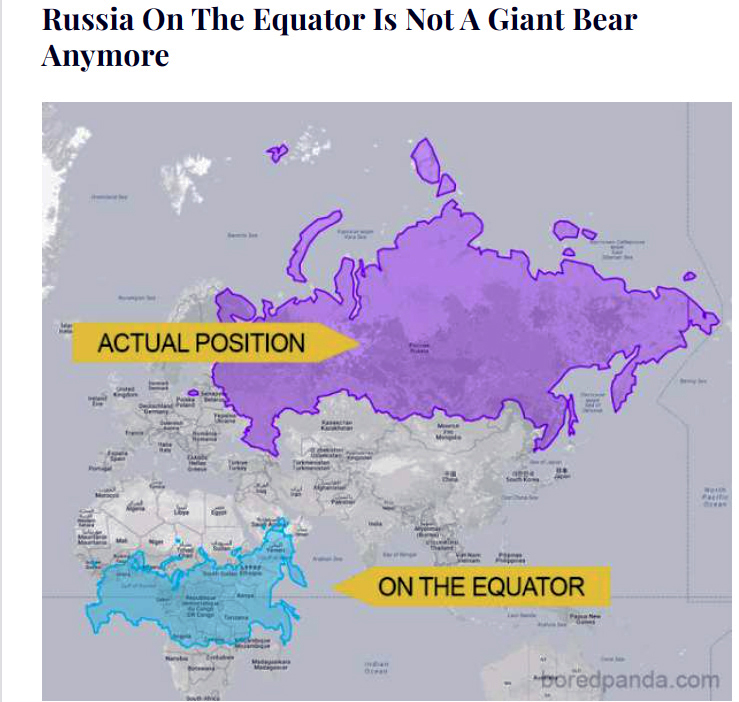
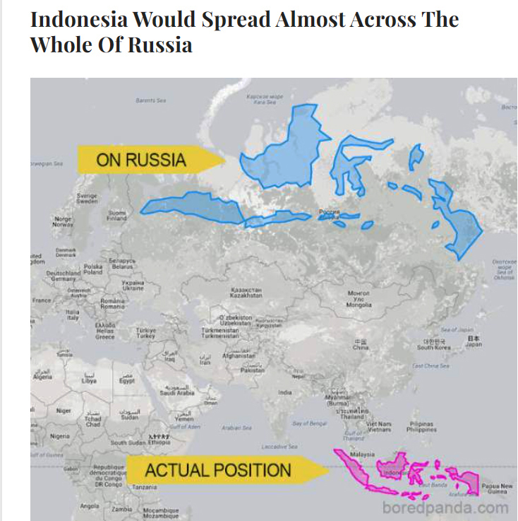
We’ve seen lots of maps showing what the sizes of countries are really like in relation to each other, sizes which are increasingly distorted on the Mercator projection as you get farther away from the equator. Thanks to Bored Panda, I’ve learned about a neat online tool, found at thetruesize.com, that let’s you play with countries on a map, moving them to new locations to see how their sizes really compare. I’ll let the examples used by Bored Panda show you the kind of fun you can have playing with this tool. You might even want to give thetruesize.com a try yourself!


Really fun—and illuminating!—to move those countries here and there. Thanks for sharing.
LikeLiked by 1 person
Thanks, Laurie. It is fun, isn’t it?!
LikeLiked by 1 person
It surely is. Gave me a different perspective. Always a good thing.
LikeLiked by 1 person
Amazing! Thanks, Jane – for your post and for sharing your resources. Pictures worth 1000 words…or more. xo! 😉
LikeLiked by 1 person
Thanks, Vicki. I’m glad you share my enthusiasm for this tool. Fun and edifying! 😊
LikeLiked by 1 person
You’re very welcome – love it! 🥰
LikeLiked by 1 person
I’ve always been fussy about geographical topics like this. This is one reason why I like to have a globe in my home.
LikeLiked by 1 person
Yes, we have one, too. Mind you, my husband’s grandfather gave it to him 70+ years ago, so many of the country names and boundaries have changed significantly. Another piece of mankind’s history superimposed on our planet!
LikeLiked by 1 person
Even though it was drilled into my head in elementary school it’s still all too easy to forget that the earth IS NOT flat and there are no grid lines IRL 🙂 Some of those comparisons were actually pretty shocking Jane!
LikeLiked by 1 person
They are, aren’t they. Even those we sort of realize that Greenland’s size is exaggerated, we don’t realize by how much, or that Canada and Russia are very big, but not THAT big!
LikeLiked by 1 person
The need for perspective. Thanks Jane, so very powerful!
LikeLiked by 1 person
Yup, there’s no doubt that our reliance on the Mercator projection for all our maps, as useful as it is, has truly distorted our perspective of the relative size of countries. For nearly 500 years!!
LikeLiked by 1 person
Oh, yes, definitely a help, but when used too much, it serves as a distortion of how things really are. Kind of crazy.
LikeLiked by 1 person
Very cool!
LikeLiked by 1 person
😊💕
LikeLiked by 1 person
So fun! I love maps. I even got a minor in Geographic Information Systems. Of course learning all about various map projections was early in the courses. I keep a globe at home, so it does give one a better perspective of relative country and land mass sizes.
LikeLiked by 1 person
Cool, GIS is quite well known in our area, but I don’t usually hear of folks from elsewhere studying it. Our university (UNB) has a world class Geodesy and Geomatics Engineering dept that has spun off a few very successful GIS companies whose HQs are here. Good choice!
LikeLiked by 1 person
So intriguing, Jane, and fun! It certainly helps change perspective.
LikeLiked by 1 person
Thanks, Debra. I’m glad you. Enjoyed it.
LikeLike
That was fun! It certainly puts things in perspective, too. Cool share, Jane.
LikeLiked by 1 person
Oh, thanks, Alys. I’m glad you enjoyed it.
LikeLiked by 1 person
This is a really interesting and timely post, Jane. We are currently in Western Australia and attended an ‘enrichment talk’ yesterday about the Australia state we are visiting. Western Australia is Australia’s largest state. The speaker also did an overlay of the state on a world map and showed us if Western Australia was a country, it would be the sixth largest country in the world. Amazing what one can learn from maps, especially if one has a visual learning style.
LikeLiked by 1 person
What fun, Barb. And what a great example. If we didn’t rely so heavily on the Mercator projection (for good reasons), we wouldn’t have these distorted perceptions of country size. I think I’ll try out what Alaska is like when it’s moved down to, say, Texas! 😏 Enjoy the remainder of your trip!
LikeLike
The last image with the US and Australia is fascinating. I had no idea that the two countries were about the same size.
LikeLiked by 1 person
It definitely makes you sit up and take notice, doesn’t it?!
LikeLiked by 1 person
Whoa. Those make for some interesting comparisons. And the comment about the size of Western Australia as a country. The one that always stuck with me is that the entire British Isles would fit inside Saskatchewan.
LikeLike
For sure. The UK and Saskatchewan are at similar latitudes, so what you see on a “normal” map is more or less an accurate comparison. SK is definitely bigger in area, in fact it’s more than 3 times bigger!
LikeLike
With a LOT less people. No wonder I get a bit claustrophobic when I am there.
LikeLiked by 1 person
😊
LikeLiked by 1 person
WOW! An entirely different perspective. When I think of these maps (every now & then) I probably won’t think of them as I always have but will see them in my head as you’ve shown them here. Thanks for sharing
LikeLiked by 1 person
LOL, I hope these different perspectives haven’t caused confusion! 😏
LikeLiked by 1 person
These different perspectives are fascinating and certainly show how distorted the world is mapped out currently. We have both wall maps and globes and it’s interesting what we learn when we place them near each other for comparison.
LikeLiked by 1 person
That’s the perfect thing to do, Rose. What a clever family! And comparing the true size (on the globe) with the obvious inadequacies of the 2-D substitute (your wall map) is also a reminder of how important that 2-D breakthrough was all those centuries ago. It’s hard to navigate from a globe!!
LikeLike
No extra confusion just interesting seeing things from a different perspective, WHICH, in the grand scheme of things may encourage some of your readers, like me, to actually remember the locations of these countries geographically. That’s a positive thing.
LikeLiked by 1 person
It is indeed!
LikeLiked by 1 person
Wow! What an eye opener!
Thanks Jane 🙏🏼
LikeLiked by 1 person
I’m glad you found it illuminating, Margaret. 😊
LikeLike